- London Finest Interior Manufacturer
Soft neutrals like white, taupe, and greige pair beautifully with a cashmere kitchen, while bolder tones such as navy, charcoal, and sage green add contrast and depth. Cashmere’s versatility makes it ideal for both warm and cool colour schemes.
When it comes to designing a timeless and elegant kitchen, cashmere is a standout choice. This subtle, neutral hue offers warmth, softness, and versatility, making it a popular pick for modern and traditional kitchen designs. But once you’ve fallen in love with this calming tone, the next question naturally follows: What colour goes with a cashmere kitchen?
This blog will explore the most stylish, practical, and complementary colours to pair with cashmere kitchen units. Whether you’re after a contemporary edge, country cottage charm, or a sleek minimalist vibe, we’ve gathered all the inspiration you need to create a harmonious colour palette that enhances your kitchen’s aesthetic and functionality.
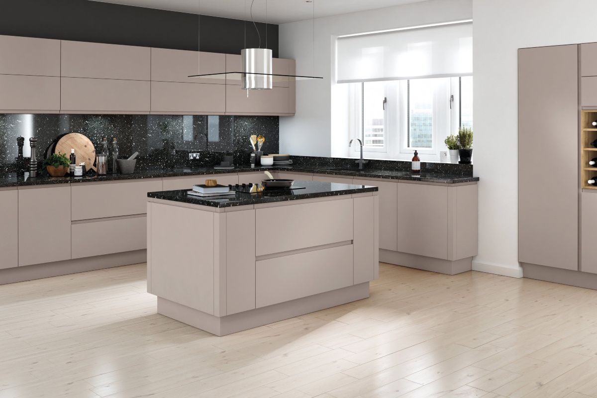
Cashmere is a refined neutral between warm beige and soft grey. It’s understated yet luxurious, perfect for homeowners seeking something more unique than classic white or cream. Cashmere kitchens feel inviting, calm, and sophisticated, making them ideal for busy family kitchens and minimalist open-plan designs.
Its main appeal lies in its chameleon-like ability to work beautifully with various colours. Cashmere acts as a perfect base, opening the door to multiple design directions, from rich tones to more fabulous shades.
If you’re aiming for a clean and airy space, white is a classic choice with cashmere. A white quartz or marble worktop alongside cashmere cabinets will enhance the kitchen’s brightness, giving it a crisp, fresh feel.
White also works well for walls or ceiling paint, particularly in smaller kitchens, where it helps maximise light and space. To complete the look, add white subway tiles or a white ceramic sink.
For a striking, modern aesthetic, graphite grey or charcoal adds contrast and sophistication to cashmere. Use it for accent cabinetry, an island unit, or splashback.
Dark greys work exceptionally well in open-plan kitchens, creating a luxurious backdrop that doesn’t overwhelm. Pair with brass handles, warm lighting, and oak flooring for a perfectly balanced finish.
Sage green is one of the most versatile hues to pair with cashmere. This muted, nature-inspired shade brings a calm, organic feel that pairs beautifully with the warmth of cashmere.
Introduce sage green through wall paint, open shelving, or kitchen accessories. It’s particularly effective in traditional shaker-style kitchens or country-inspired interiors.
Looking to make a statement? Navy blue is an excellent companion to cashmere. The rich depth of navy contrasts beautifully with the soft warmth of cashmere, offering a dynamic yet elegant look.
Navy works well for kitchen islands, splashbacks, or even feature walls. This pairing creates a luxurious, design-forward kitchen with a bold personality.
For a cohesive, tonal design, stick to colours close in hue to cashmere—warm taupe, stone, or greige (a blend of grey and beige). These soft, neutral tones create a seamless, understated, cosy and contemporary look.
This palette works exceptionally well with matte finishes, soft lighting, and minimalist styling. To bring everything together, use taupe tiles, greige walls, or light oak floors.
Blush tones pair beautifully with cashmere, particularly in homes where a subtle touch of femininity or romantic charm is desired. The warmth of cashmere complements the soft pink, creating a harmonious, gentle look.
Blush pink can be introduced via paint, splashbacks, bar stools, or small appliances. Keep it soft and muted to maintain elegance.
For a more dramatic take, consider olive green or forest green. These colours bring depth and a luxurious edge to the lightness of cashmere cabinetry. The result is a bold, inviting space that feels grounded and connected to nature.
Dark green works well on walls, tilework, or lower cabinets. The contrast adds personality without overwhelming the space.
While black might seem too stark at first glance, strategic black accents lend a sleek, modern look to a cashmere kitchen. Think black tapware, pendant lights, stools, or even window frames.
These touches ground the design, creating definition and structure without overpowering the soft cashmere base.
Try adding terracotta, rust, or burnt orange for a Mediterranean-inspired feel. These earthy tones enhance the warmth of cashmere and bring a rich, sun-drenched vibe to the kitchen.
Consider terracotta tiles, rust-coloured accessories, or clay-toned paint. These colours make the space feel instantly more inviting and full of character.
Light blues, such as duck egg, powder blue, or sky blue, introduce a gentle coolness that balances the warmth of cashmere. This combination creates a refreshing, breezy atmosphere perfect for relaxed living.
Blue can be used on the walls, in tile detailing, or through decorative accessories like crockery and textiles.
Flooring plays a huge role in tying together your colour scheme. Some top options include:
No kitchen design is complete without carefully chosen accessories and lighting. In a cashmere kitchen, go for:
A cashmere kitchen is a stylish and elegant choice that provides a timeless backdrop for various colour pairings. Whether you lean towards bold contrasts or subtle tonal layers, the versatility of cashmere allows you to create a kitchen that reflects your personality and lifestyle.
From calming blues and earthy greens to modern greys and bold navies, countless colours complement a cashmere kitchen. Consider your lighting, layout, and desired mood, and let your creativity guide the final palette.
No matter your taste, one thing is certain—when paired thoughtfully, cashmere will bring warmth, elegance, and timeless charm to the heart of your home.
Cashmere is a warm neutral with undertones of beige and grey. Its soft, cosy appearance makes it versatile in both warm and cool palettes.
Absolutely. Cashmere’s light tone helps to reflect light and create a sense of openness, making it ideal for compact spaces.
Popular choices include white quartz, grey stone, black granite, or wooden worktops. The best option depends on whether you want contrast or tonal harmony.
Yes, black appliances can offer a sleek, modern contrast to the softness of cashmere. Just be sure to balance with other black accents so it feels intentional.
Cashmere is often considered a warmer, more distinctive alternative to white or cream. It’s less clinical than white and offers more depth than cream, making it a popular choice for those after a sophisticated yet subtle look.
Weekly and Monthly Sales, Discounts & More!
